


Before today’s main event comparing pairs:
I just discovered that Rolex now publishes its service costs, broken down by 4-, 5-, and 6-digit references. Take a look here ($660 for a modern Explorer vs. $1,650 for a vintage one).
Loupe This is running a thematic “Time Capsule” sale this week, featuring dozens of watches it describes as new or new-old-stock. It’s worth scrolling through to see what an excellent-condition 1016, Lange 1, 5513, “Ghost” Santos, and more look like (and very on theme for what’s below).
Studio Underd0g says it sold 5,470 Series 04s in the 24 hours after launch, and had to pause orders. Totally deserved for the clever weekend calendar display.
You might know I don’t like double-pass straps: an extra layer of fabric under the caseback, propping the watch up for no reason, plus a tail to tuck. The Crown & Buckle Chevron Adjustable is single-pass, no excess tail, and it adjusts, so you’re never stuck between holes. Made of super high-quality Jacquard fabric, so the patterns are always woven, not printed. Shop the Chevron Adjustable here.*
*Sponsored by Crown & Buckle.
Two of a Kind
Same reference, different watch.
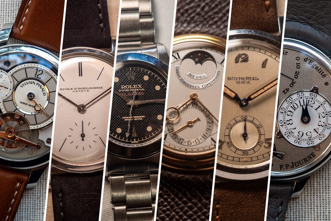
In last week’s Geneva dispatch, I observed that auction catalogs are becoming more similar to each other, and more like whatever’s popular on Instagram.
I counted at least 50 references that showed up more than once across the auction weekend. The two most common pieces of collecting advice are to see watches in person and that condition matters. But we don’t usually explain what good condition actually looks like.
So I ran around Geneva all weekend trying to compare it across six pairs of watches:
Patek Philippe Calatrava ref. 565
Urban Jürgensen Ref. 2 Perpetual Calendar (four of them!)
Rolex Milgauss Ref. 6541
“Patek Philippe ref. 2509” School Watch
Brass-era FP Journe Tourbillon Souverain
Sylvain Pinaud Tourbillon Origine
On websites and in catalogs, the differences, flaws, and character are often flattened out (or downright hidden). That changes in person. My photos aren’t perfect, but they show enough.
Mostly, the results track what you’d expect after close inspection. But for at least one pair, that’s not the case.
When condition is paramount
Patek Philippe 565 w/ Breguet Numerals
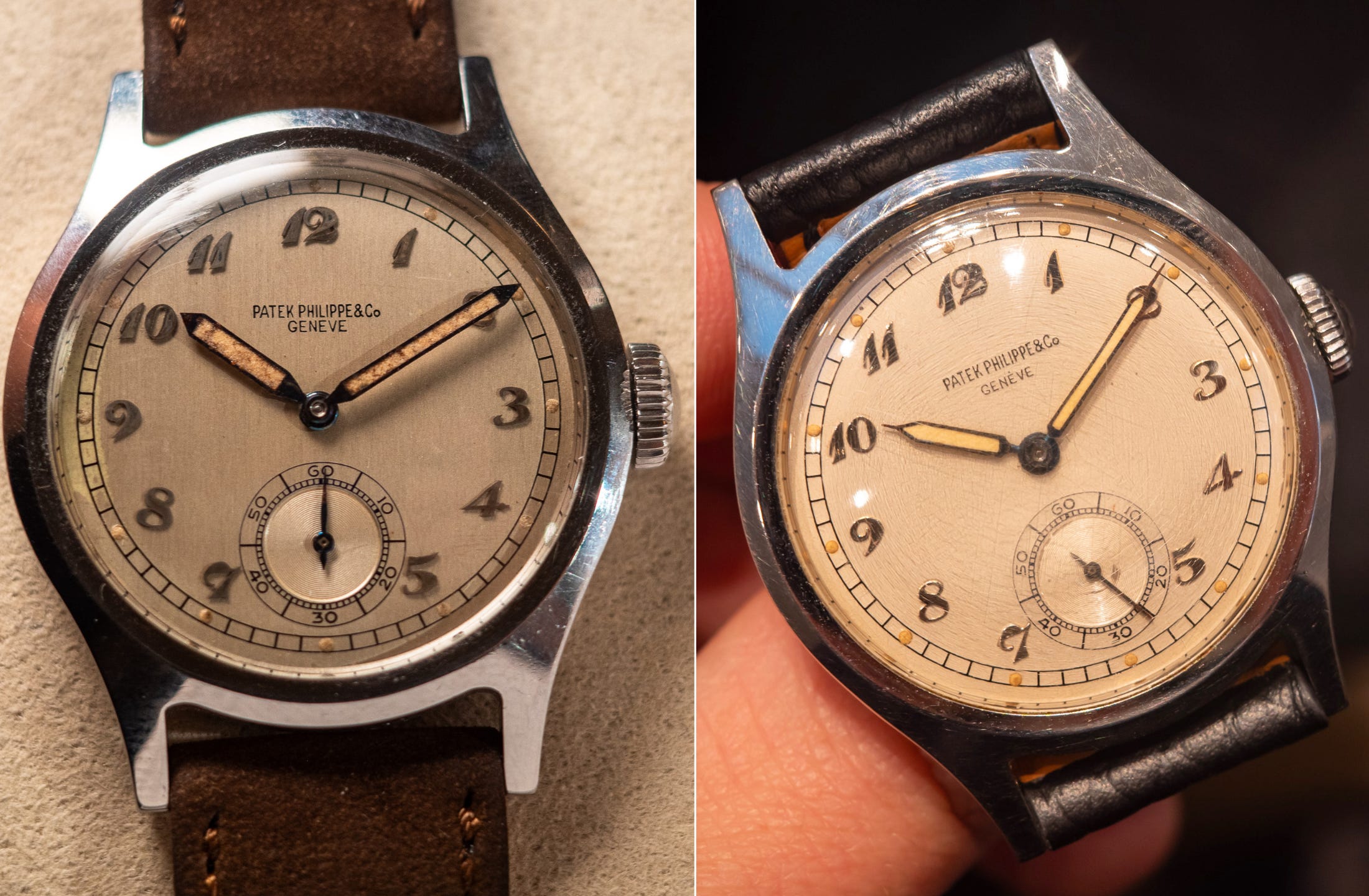
Christie’s, sold CHF 89.6k
Sotheby’s, sold CHF 128k
For vintage Patek Philippe in particular, condition is everything. This Calatrava ref. 565 pair from the 1940s with Breguet numerals and radium lume shows how it makes all the difference.
First look at the 565 from Christie’s that sold for less. Zoom in and it shows classic examples of a dial that’s been restored (read my primer on engraved enamel dials):
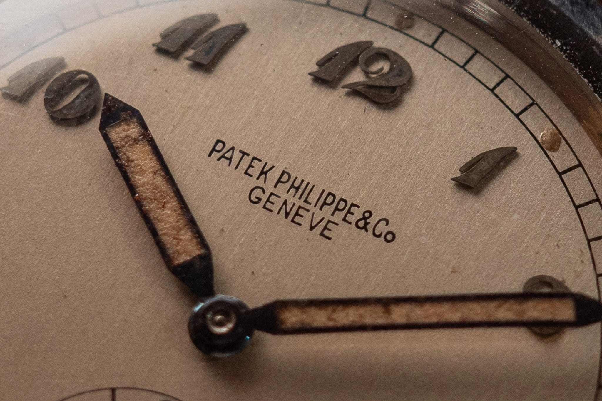
Vertical striations on the dial, often a sign of cleaning
Under the numerals, the attachment holes have become visible (see under the “2” in 12 o’clock). During a cleaning, numerals are removed, and the dial is lightly sanded down to remove impurities. This abrasive sanding can enlarge those holes, making them more visible. Also note the scratches and signs of handling on the numerals.
It’s lost the comma after Patek and the accent above Genève, further signs of cleaning
Partially missing lume plots (e.g. at 4 o’clock)
Water damage at 9 o’clock
The dial on the 565 at Sotheby’s, which sold for nearly 1.5x, was hidden beneath a crazed crystal. A specialist provided the below photo, which shows a dial in good condition underneath:
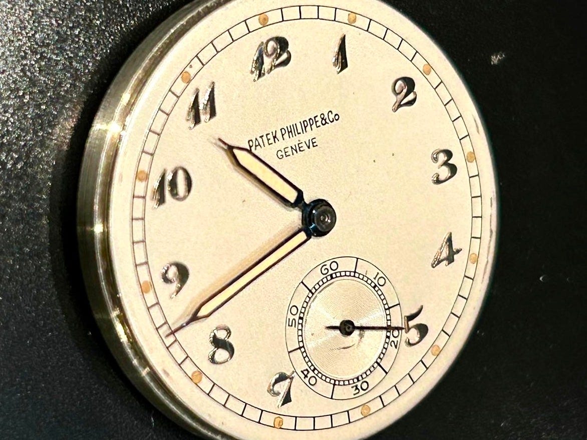
Notice how it doesn’t have the signs of cleaning or restoration that the previous dial does
There’s still wear, for example near the seconds hand
The hands have also clearly been relumed, and I’d bet the winner has these fixed or color matched. Given that, the dial has probably been lightly cleaned before, but it seems less invasive than on the previous example
The biggest flaw was the hands. But you can fix hands; you can’t fix a dial. Sotheby’s 565 came from the family of the original owner, and it simply felt like a fresh, honest watch. It wasn’t perfect, but it wasn’t pretending to be.


When condition isn’t everything
Four Urban Jürgensen Ref. 2 Perpetual Calendars
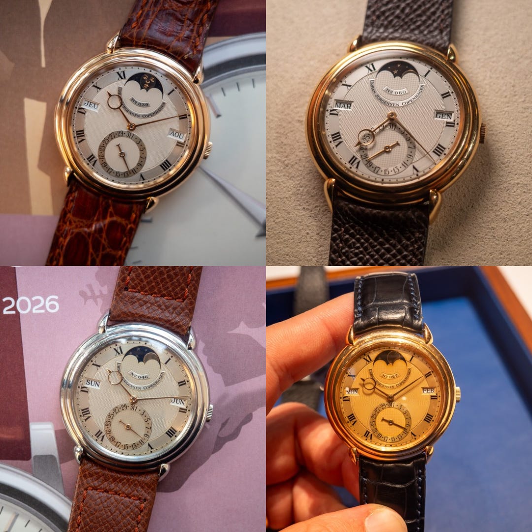
Pink “moon face,” sold CHF 120k (Phillips)
Yellow gold, sold CHF 128k (Christie’s)
Platinum, sold CHF 139k (Phillips)
Pink-on-pink, sold CHF 358k (Sotheby’s)
Urban Jürgensen was everywhere in Geneva. I saw four Ref. 2s, the Perpetual Calendar produced from 1986–1993 during the Derek Pratt era.
The smooth, pebble-like case and teardrop lugs had never quite appealed to me, but after getting a close look at each of these, I was surprised how different each felt.
UJ made about 175 examples of the Ref. 2: 50 in platinum and the rest split between yellow and rose gold (with a few custom-orders in white gold).
Notes on the examples I saw:
The platinum Ref. 2 had the sharpest case and hallmarks, giving it a clean, modern look; on the other end of the spectrum, the pink-on-pink example had the most polished case and worn dial, making it feel like a real vintage watch—even though the platinum example was actually produced earlier (1990 vs. 1992).
That pink gold Ref. 2 with matching pink dial—said to be unique—stole the show, selling $424k. The hallmarks below show that it had easily the softest case, but that hardly matters with a configuration like this. The smooth case design can handle a polish or three, though eventually the stepped bezel sacrifices some definition and the teardrop lugs lose volume.
Here’s what the hallmarks on each look like:
Below: Five comparisons to go. how each UJ felt different; two Milgauss 6541s with a $50k gap; and the Journe result I can’t explain. To read the rest, join for $8/mo (or $80/year):
